What we built
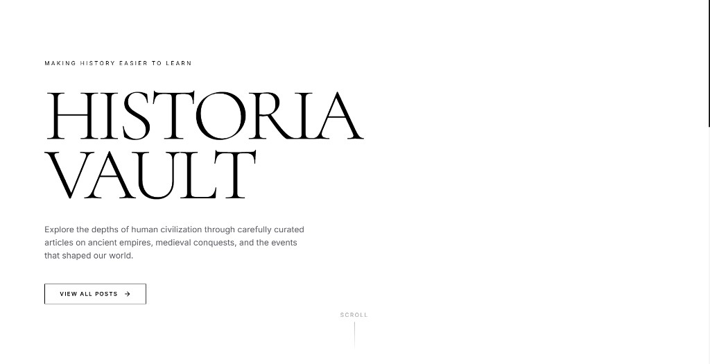
Historia Vault needed a first impression that felt scholarly without feeling heavy: room to breathe, a strong title lockup, and a single primary action to browse posts.
We shipped a monochrome editorial landing experience with intentional whitespace, serif display for the brand mark, and a clean CTA into the content library, easy to scan on phones and simple to expand later.
Highlights
- High-contrast black-and-white editorial system
- Display typography that carries the brand
- One clear CTA into posts
- Mobile-first spacing and hierarchy